Pages

Pinterest

October 28, 2013

Fall Swim

With watercolor being an up and coming challenge over at Eclectic Paperie, I decided I'd try my hand at watercoloring on this swimming layout.  Fitting don't you think? WATERcolor with swimming!!  Anyway, I also tried a new technique.   


I laid out my non-stick craft sheet and lightly sprayed color mists directly on the sheet and then diluted this by spray by spraying water directly on top.  This helped thin my colors.  It is hard to see in this photo but look closely!


I then turned my paper face down onto the wet puddles of spray.  When I lifted and turned my paper over, I could see where the colors mixed on my paper.


Once I decided where my photo and papers were going to be, I got out my Tim Holtz Stars Layering Stencil and with a gray watercolor pencil, I traced where I wanted random stars.  With a blender pen or water brush, I lightly went over the pencil marks to make them blend like watercolor.


See the stars?  I then took the same colored pencil and drew light lines and lightened those with the same blender pen.  


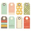
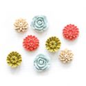
Layered on my tags, ephemera embellishments and resin flowers.


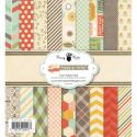
This Fancy Pants line, Happy Go Lucky, was PERFECT for the colors in my photo.  I must say, I have tons of product left that would create a completely different style layout.  After this layout was complete I trickled droplets of gold spray in various places and used gold thread to sew.  This time, the sewing helped keep my tile and small embellishments in place.  

You can find the items from this layout at Eclectic Paperie or link on the item below.

Mary-Ann


October 26, 2013

OBI WAN


Bubba has recently been repeating, (and I mean REPEATING!) "How much wood can a woodchuck chuck....." So I have that tune in my head but with different words, "How much flair can you fit on a page...." Get the idea?  With Halloween fast approaching, I needed to do something with last years photos.  I have included 5 flair on this 12x12 layout!  With repetition being the key word around here lately, I decided to repeat flair going down my page, creating a straight line.  There is never too much flair!

IMG_1638

IMG_1636

If you look closely at this page, it rather quite simple.  I layered three papers for my base and let the paper design do most of the work.  A couple random strips of paper, a few cut circle from the paper, a tag, washi tape, a title, cute photo and flair.  Lots of it!  I had several other photos that I wanted to use as well so I decided to accompany this layout with a Project Life page.  My first ever completed Project Life!

IMG_1641

IMG_1639

With using an assortment of photos, there is not much room for embellishing.  So, I kept this side simple as well.  This Teresa Collins line was a perfect pairing for my spooky pictures.  

IMG_1642
Here is what this double page will look like displayed in my album.  I hope that you are inspired to dig out some creepy photos and create something spook-tacular with flair!

Mary-Ann

Below is a list of flair I used in this layout.
Il_570xN.512919311_cect

Il_570xN.378044535_af5m
Il_570xN.515167720_bseo
Il_570xN.420505078_2pxj


October 22, 2013

Two Peas

Sharing a little more GREAT news with you today, I have been featured over at Two Peas in a Bucket for  the Gardener's Digest Blog Hop.  Garden Girl - Lisa Dickinson has highlighted my "RED SOX" layout I just posted here a couple days ago.  Head over to her blog to see what she has to say!


Smiling from ear to ear,
Mary-Ann

October 21, 2013

The Rubber Cafe


I am so excited to share some exciting news with you.  I have been invited to be a guest designer over at The Rubber Cafe for the month of November!  You should see the goodies I just received from my BFF Miss Donna, my postal goddess.  

Here are a few of my favorite things amongst the box of plenty.

Here a few of my favorite sheets of paper from Echo Park - tis the Season line.  That candy cane striped  is just delicious!

I love this background snowflake stamp.


Clever and cheeky sayings!  Do you spot that tiny deer?  


Love at first sight - this fancy guy is just screaming my name.


Luscious yards of ribbon, more please!


Queen & Co. self-adhesive rhinestones.


Drum roll please........my favorite of the bunch, little sequins, jingle bells and snowflakes in my tiny new dish.  If your interested in joining me for the month of November, head over to The Rubber Cafe to get this months collection.

Mary-Ann


October 20, 2013

RED SOX


Of course everyone has their own favorite ball teams.  We here in the Maldonado house hold, root for all New England teams: Bruins, Patriots, Red Sox.  My boys were lucky and went to a Red Sox game last year and I was lucky enough to receive some really cool baseball flair to spruce up my layout.  I started with the "Antiquary"monthly club kit club from Studio Calico.  Threw in random Teresa Collins word strips, Studio Calico Tags, Whisker Graphics twine and some Freckled Fawn paperclip arrows.  This layout was super fun!  The bright colors highlight the excitement on my boys faces.  They just really enjoy doing anything together.

IMG_1624
I used wet adhesive to attach these clear acetate letters.  Covering the entire back with a wet glue, makes it so you don't see any adhesive.  

IMG_1625
Didn't want to part with baseball flair.  It is my fav.  I anchored it with a circle.  The dark blue border helps the white flair pop off the white paper.

IMG_1626
Here you can see how I buckled my word strips to provide additional dimension to my layout.

IMG_1623
If you look closely at the photo, in the upper left corner, you will see photo bombers.  I cleverly placed a word bubble with word strips and voila, they were gone!

IMG_1622
Thank you for stopping in today.  I hope that you are inspired to throw some flair on your next layout.  

Mary-Ann

Below is the set of flair that I used on this project:  All Flair can be purchased over at A Flair for Buttons

Il_570xN.430394634_4asw


October 17, 2013

Jell-o

My gangsta likes to make pudding and Jell-o all the time.  Well, anytime I will let him.   So, on this day (the one in the layout) I let him make it by himself.  (Notice my polish pottery?)  I decided this Studio Calico kit was as good as any to highlight my little Masterchef Juniors Jell-o making skills.  I emphasized my layout with GOLD, my new obsession and seems to be very trendy right now.  The kit is "Antiquary" by Studio Calico.  The only problem that I have with some of the items in the monthly collections is that you can not figure out who manufactured some of the products.  Like in this kit, there are badges but you don't know who by.  There is a mixture of SC and Dear Lizzy papers and I added in Crate Papers Flea Market overlays (the gold framed acetate) and ephemera (the little bits and pieces.)  I also brought it MME Rhinestones from "Funday" and Heidi Swapps Gold Color Shine.    


The gold scallop is a doily I cut up  from the Flea Market Ephemera packet and used sections of it in different places.


I lust over that gray floral paper lining the bottom of my layout.  I kept that section simple and clean, allowing that paper to just shine!  I love it.  Now that I am looking, I added the gold Color Shine after I had taken my photos.   Bummer.

Thanks for stopping in.  I have been on a scrapbooking kick lately so be sure to stop back by real soon for more.

Mary-Ann