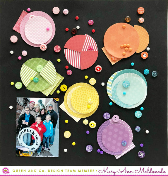
Ever inspired by an ad in a magazine, a graphic on the front of a box, or something you see on Instagram? Well, I was completely inspired by a photo from the 'ohhappyday' Instagram page. When Wendy sent me the Circle Shaped Shaker, I new exactly what I was going to do. It also helps share how cool all the embellishments are in the Queen and Company shop. Here is what I did....

Here is the photo that I was inspired by. Sometimes, a piece maybe inspiring and it takes you on your own journey. This one, I duplicated almost exactly.

I used the circle negatives from the dies in the Circle Shaped Shaker set, and trimmed some in half. Then paired them with an opposite patterned paper to add more depth. I riffled through the paper pads that I had and found EVERY color I needed. Finding the colored embellishments was super easy too. Everything just pops off the black background.


My boys favorite color is purple! How could I not show you a close up of that section? Since taking these photos, I have decided that the layout needs journaling. I may add that to the back of the layout or a little under the colorful photo. See below for all the bits and pieces that I used. They are all extremely reasonably priced through the Q&C store.


I adore this! Such an awesome inspiration. Love all the colors against the black background..So striking!
ReplyDelete